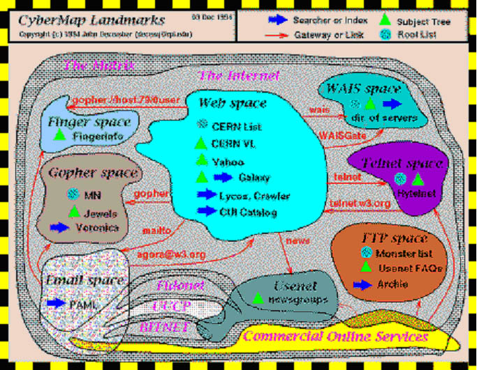
Figure 1 - Conceptual map of Internet information spaces, according to John December (1994)
MAPPING NON-SPATIAL PHENOMENA
Introduction
Maps can be instruments for prognosis: if you know where you are on the map, the map will tell you where you will arrive or what you will see or what to expect when moving in a specific direction. This is not only valid for maps of spatial phenomena but for non-spatial phenomena as well. Moral fantasy maps for example, a 16th-19th century phenomenon, will prove this: if you are at a certain station in life, the fantasy maps will tell you what to expect if you move in a certain direction, such as falling in love, or getting to heaven - at least according to these maps. Such fantasy maps are not models of spatial reality but models of the options we have during our journey through life. The maps show us what to expect during this journey, and what the consequences will be of our choices of directions.
Apart from instruments for prognosis maps can be tools for showing relationships. The distance between points close by is smaller than that to points further apart on the map. Cartography can also be used as a means for just ordering some domain and providing insight into the links between phenomena, as is the case in the maps of Cyberspace (Jiang and Ormeling 1997, see figure 1). Important aspects in these maps are the regionalisation and the (non)existence of links between the regions discerned. As such these maps are not much different from fantasy maps as the 18th century map of Schlaraffenland (see figure 2, showing all the human vices). By studying maps of non-spatial phenomena, we are able to distil the contributions of maps (i.e. their fundamental geo-spatial connotations) in analysing 2D or 3D space, especially data space, without being sidetracked by the actual geographical information on the real world, be it geometrical, topological or semantical, provided by the maps.
Figure 1 - Conceptual map of Internet information spaces, according to John
December (1994)
There is an increasing number of 2D or 3D data analysis techniques. The concept
of spatiality or graphic spatialisation has grown roots, to speed up the extraction
of information from large databases; there is brand mapping, proximity scaling,
knowledge maps, correspondence analysis or perceptual mapping. To a large degree
these techniques are based on our understanding of maps (Couclelis 1998). After
showing the contributions of the use of the two dimensions in fantasy maps,
we will apply our understanding to modern techniques of spatialisation and illustrate
this with a case study of analysing the data space of the 2001 International
Cartographic Conference in Beijing.
Organising principles of 18th century maps of non-spatial data
When one studies these maps, and tries to analyse their characteristics and the information they convey, there appear to be a number of organising properties, that have to do with the use of space, be it two- or three-dimensional. I will be looking at the directions, scale, distances, regionalisation, topology, toponymy, and symbolization consecutively:
Figure 2 - Map of Schlaraffenland
The orientation of most fantasy maps is such that one starts the journey at the lower centre and proceeds to the top. At least that is the standard orientation of most moral maps. This practice coincides with the optimal orientation for road maps, as the lower end of the map is closest to the reader. There seem to be only a few exceptions such as the Schlaraffenland map, where the cardinal directions seem to play a role. Mostly, the directions have only a relative connotation: if one strays too much from the principle direction to true love or to Salvation, one misses one's destiny (see the Carte du Tendre in Figure 3: if one strays too much from the direction due North along the river, one ends up either in the Lac d'Indifference or in the Mer d'Inimitié).
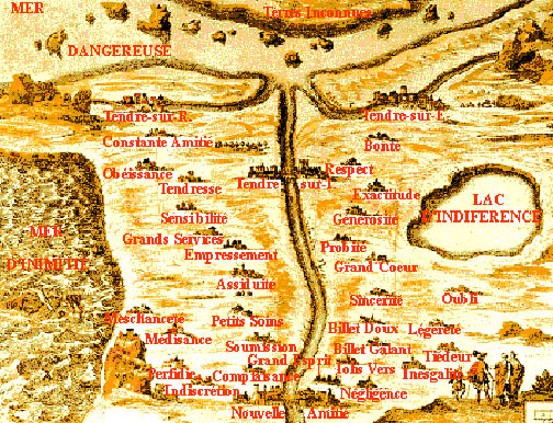
Figure 3: Carte du Tendre
Causal relationships can govern reading directions as well: in Schlaraffenland there, in the region of Youth, the river of Original Sin, with its tributaries Adam's Fall and Eve's Fall passes along the places Conception and Birth. A prime indicator of directions is the linear elements, such as roads or rivers. As roads form links, road names might provide information on the direction in which the road has to be travelled. In Schlaraffenland, in the region of Youth, one may take to the road at the place of Birth, the name of the road is "Make your choice", and at some point it bifurcates, and continues in one direction as the Road towards Life Eternal and in the other direction as the Road towards Idleness and beyond.
Generally, fantasy maps are scale-less, officially that is; but actually, by their use of symbols from geographical maps, they contain indications of absolute magnitude. The average distance in-between settlements may vary between geographical areas, but 5-30 km would be a good guess; relating this to the distance between settlements on the fantasy map would give an indication of their scale and scale can be translated into (travelling) time. Scale can also be understood as resolution or hierarchy. The larger the scale, the larger the number of items shown, with the more important items only named at smaller scales. The degree of detail increases with the map scale.
Distances between items are either larger or shorter than distances to other items, and that has connotations of familiarity. Distance is a metaphor for similarity (Fabrikant 2001a). The further away items are, the more unfamiliar or dissimilar; the closer items are to each other, the more familiar or similar they are to each other. This can be strengthened by cartographical cues like similarity in symbols shapes or in linguistics. In Schlaraffenland remoteness would mean unfamiliarity; maximum distance would mean maximum unfamiliarity that is the opposite: Heaven and Hell are at opposite sides of the map; so are youth and old age.
In the Country of Love (Figure 4), 7 regions can be discerned. From the seven possible destinations from the Land of Youth only the Land of Happy Love is a positive destination. If the surface areas of the possible destination regions are taken into account then in Love there seems only to be a 1 in 7 chance of a happy end.
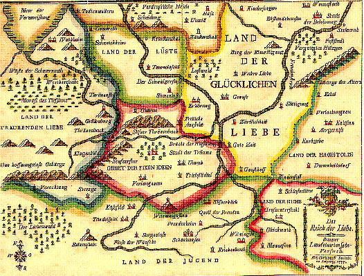
Topology cannot have been much of an issue when the moral fantasy maps studied here were produced. In the Country of Love: the region of happy love is adjacent to all other areas, the Region of Sad Love excepted, which is separated from it by the Territory of Fixed Ideas, or the Land of Lust (with Hospital at the far end). The same is valid for Schlaraffenland: there is no rational sequence in the inventory of our vices. Similarity to existing place names strengthens the idea of real maps, and their properties.
By the use of symbols, fantasy maps are even more linked to regular maps. So symbols such as rivers or mountains serve as barriers or view sheds one has to overcome, in order to reach a certain state. Symbolisation can be understood as two processes. In our Fantasy map examples, there is first the assignment of concepts to geographical objects, and secondly the rendering of these geographical objects with cartographic symbols. For the first step one needs contemporary knowledge that seems to be lost now. The latter step contributed to the contemporary understanding of these moral schemes as maps, even if the producers understood the implications of these symbols insufficiently. The meanings assigned to mountains, passes, bridges, swamps or pinnacles might not be the same as they are now.
What is lacking when we compare these fantasy maps with 20th century geographical
maps is the logical geometry, based on a formalized coordinate system and a
continuum of geographic scale (Fabrikant 2001b). Bertin (1977) made us aware
of the fact that the image plane should be continuous and homogeneous, wherein
every visual variation should be significant. Coupled to these theoretical innovations
there is the quantitative revolution in geography, which led to the quantification
of relationships and new techniques for their rendering, such as multidimensional
scaling (MDS). Spatialisation can be regarded as a cartographic procedure but
also as information visualization that is the use of interactive visual representations
of abstract non-physically based data to amplify cognition (Card et al 1999).
Spatialisation
Spatialisation is the visualization of non-spatial data in two- or three-dimensional space, by adding a spatial component to the data, in order to get more insight in the data. (Card et al 1999). Because of these added spatial attributes, spatialisation can be regarded as part of cartography. As spatialisation can contribute to our knowledge of the structure of large databases, they can also be seen as a form of metacartography. Quantification cannot only be visualised through the use of coordinate systems (size of an area) but also through the use of the third dimension (height of an area). The context in which objects are located can be seen from their position in data space and relationships can be visualized. As the use of maps is something people are trained in from primary school onwards, and therefore "spatial experience is so fundamental to humans, spatial metaphors act as fundamental sense makers for abstract domains" (Fabrikant 2000). The difference between spatialisation and the fantasy maps referred to above is their quantitative character; because of this quantitative character it has been possible to develop software programs to effectuate these spatialisation.
In order to provide the data with a place in the spatialisation, their location in a coordinate system has to be ascertained. Assessing the mutual distance between all different objects to each other does this, on the basis of the information these objects contain. These
distances cannot be expressed in spatial units like kilometres, but in other
units like the degree of similarity. Two forms of spatialisation can be discerned
(Fabrikant and Buttenfield 2001): semantic and geometrical spatialisation. In
the first, the distance between the objects is computed on the basis of the
textual content of the objects, which are then transformed into numerical data;
in the second one the distance is assessed directly on the basis of numerical
data.
The correspondence between documents can be assessed on the basis of their keywords, of the total amount of concepts, names, or on the basis of the references used. The least expensive method to assess the correspondences is automatic text analysis, which produces word by document matrices (see figure 5). Every single document can be regarded as a vector in a multidimensional space. Every word represents a dimension, and the frequency with which each word occurs denotes the location in the relevant dimension. The location of document 3 in figure 5 can be rendered by the vector D3(0,3,1,…,0). Every document in this way has a specific location in a multidimensional vector space model. In order to reduce the number of dimensions, only the significant words are taken into account, and there are text analysis programs, like TextAnalyst, that filter documents in this way and count the remaining significant words. These word counts can later be imported into packages that produce relational databases.
In order to render the multidimensional space in such a way that people are able to conceptualise it, it has to be transformed into two- or three-dimensional space. In this transformation process the distance in-between the objects is quantified through the word by document matrices. There are various techniques to do so, amongst them multidimensional scaling (MDS) and the Self Organizing Map (SOM).
1 2 0 1
0 1 3 1
0 0 0 2
1 0 0 3
|
|
|
|
|
|
|
| Word1 |
|
|
|
|
|
| Word2 |
|
|
|
|
|
| Word3 |
|
|
|
|
|
|
|
|
|
|
|
|
| Wordt |
|
|
|
|
|
Figure 5 - Example of a word by document matrix
For multidimensional scaling first a similarity matrix has to be produced from
the word by document matrix. This is done by the cosine method, which compares
the various vectors, and assesses the angles between them. The cosines of these
angles are then interpreted as the similarity values. The smaller the difference
between two vectors, the smaller the angle and the larger the cosine. A cosine
of 1 means a maximum correspondence and a cosine of 0 a minimum correspondence.
Figure 6 is an example of a similarity matrix. Document 1 and 3 thus look more
like each other than document 1 and 2, and should therefore be placed closer
together on the spatialisation. With the data in the similarity matrix a MDS
analysis is executed to compute the place of every document in a conceptual
(two or three dimensional) space.
|
Document
|
|
|
|
|
|
| 1 |
|
|
|
|
|
| 2 |
|
|
|
|
|
| 3 |
|
|
|
|
|
| 4 |
|
|
|
|
|
| 5 |
|
|
|
|
|
Figure 6 - Similarity matrix
Another method to visualize the correspondence between non-spatial objects would be the Self-Organizing Map (SOM), devised by Kohonen (1995). According to this method multidimensional data can be located on a pre-defined two-dimensional raster pattern. In an iterative process the values of the elements in a raster pattern (called neurons here) are increasingly conforming to the document vector values, in a sort of optimalisation process. Eventually all neurons get one ore more documents assigned to them.
The most important difference between these two spatialisation methods is that with MDS all data objects get a place in a space that is created on the basis of the data, while the SOM-method gives the multidimensional data a place in a pre-defined space.
The spatialisation of large data quantities is a good method to get insight in the data structure. A disadvantage however is the information loss, anyhow occuring when the number of dimensions is reduced, which can be a problem for the position of individual data objects. Cartographers know that information is lost when depicting three-dimensional information on a two dimensional surface. When making spatialisations sometimes hundreds of dimensions (depending on the data) have to be reduced to two. The result is a deviation of the distance data objects have to each other on the eventual spatialisation, compared to the distance they have to each other in the original multidimensional data space.
The larger the number of dimensions that has to be reduced to make a spatialisation, the larger the deviation will be. This makes especially the MDS method inaccurate for the spatialisation of great data quantities. Because the data objects on a SOM-spatialisation are 'locked' on raster nodes, the deviation of data objects is relatively smaller, when the number of dimensions the data consists of is very high.
In the next part of this paper the usefulness of spatialisations will be illustrated
with a case study, which analyses the data space of the 2001 International Cartographic
Conference in Beijing. About 250 papers are taken from the conference proceedings
CD-ROM, to be analysed and spatialised. Figure 7 gives an overview of all the
steps that are involved in this process and the software that is used to make
a (MDS) spatialisation of this congress.
Case study: the Beijing 2001 International Cartographic Conference
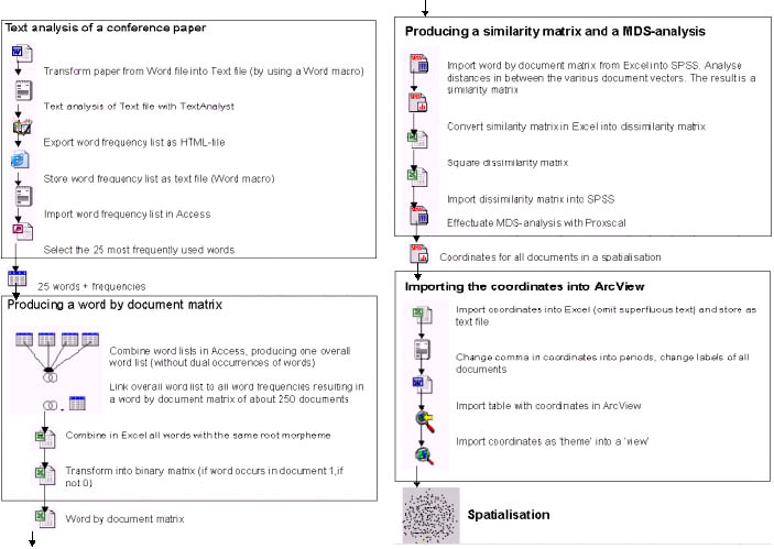
Figure 7, 1-4: Procedure used in spatialising the ICC conference papers
Spatialising the ICC conference papers
According to the method indicated in Figure 7, 1-4, using similarity matrices, transformed into squared dissimilarity matrices (in order to strengthen clustering between related documents) MDS analyses were executed, which reduces the multidimensional data to two dimensions. The resulting spatialisation will tell us something about the structure of the database; the location of each object in the visualization tells us about its position with respect to all other objects. Some documents will have a central position, because they have the greatest similarity to all other documents, others will have a marginal place because they have few or no (key)words in common. The result of the spatialisation is shown in figure 8 (left). As no further processing of the data in this format is possible, it has to be converted into ArcView, which is realized in Figure 8 (right). The 'view' in ArcView is an interactive map that can render and analyse geographical data. The characteristics of the 'view' have to be set in such a way that the coordinates of all spatialised documents can be rendered correctly.
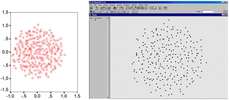
Figure 8 - Raw spatialisation of ICC Conference papers (left) and the same
spatialisation imported into ArcView (right)
The first step in the analysis would be the addition of coordinates (these would lie between ±1 from the origin). The big advantage of the use of a GIS is that one can work interactively and visually with the tables that have been linked to the visualization. One may select congress themes, and check whether the papers that have been assigned to each theme show a clustering or not, or whether they have a wide dispersion.
The analysis per congress theme leads quickly to a dichotomy in the spatialisation:
a number
of themes have more links with digital cartography and others are primarily
linked to concepts or keywords associated with analog cartography. The difference
between the two sections would be that in the first one the use of computers
seems to be essential, while with the themes classified as analogue the computer
is only used as a tool. So a typical example of an analogue congress theme is
'National and Regional Atlases', while 'GIS and Digital Mapping' would be a
typical digital congress theme.
With the use of the Spatial Analyst extension in ArcView for both of these groups of themes the 'document density' can be assessed at each location (by computing the distance from each document to the points of a grid overlaid over the spatialisation). When realized there appears to be a distinct regionalisation: everywhere where there are high values for the 'digital' themes, there are low values for 'analogue' themes and vice versa.
In order to add extra information, keywords can be linked to the spatialisation. The 100 most frequently used words can be selected from the word document matrix, and these can be added to the table with the document coordinates. By querying all documents containing the word 'GIS', the density of these documents can be ascertained; the location with the highest value can be regarded as the gravity point. This is the place where the keyword will be placed on the spatialisation. Not all keywords are suited for representation, as some are so general that they would automatically end up in the center of the visualisation. By varying the size of the typeface rendering these words, an idea can be conveyed of their relative frequency. See also figure 9.
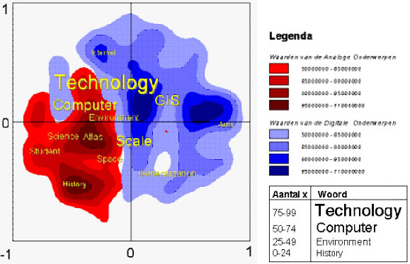
Figure 9 - Spatialisation of the difference between the groups of analogue
(red) and digital (blue) map themes, incorporating keywords
In Figure 9 the higher frequency values have been rendered in larger typefaces, but other methods are possible here, especially the use of the third dimension. In order to realise this, the raster grid has to be converted into a Triangulated Irregular Network, a TIN, which subdivides the raster grid into adjoining equilateral triangles. Each corner of a triangle has a height value, based on the value of the raster point underneath. To make a 3D-picture in ArcView the 3D-Analyst is used. The effect of this 3D surface will be even more dramatic by adding hill-shading effects. A further advantage of a three-dimensional over a two-dimensional representation in ArcView is that - apart from the possible overview - the images of the two groups of themes can be overlaid, without masking each other. As the values of the raster points now have a meaning as height indicators in the third dimension, the raster point of the group with the highest value for a position will be rendered. Different legend classes can be added (such as contour lines with the class boundaries for values for densities of digital or analogue papers). As 3D-Analyst is unable to add either coordinate systems or keywords to the spatialisation, other ArcView extensions have to be used. The coordinate system has to be added for reference purposes. As indicated earlier the x- and y-values vary from -1 to +1; the maximum document density is 110 000 000, and this is used as the upper boundary of the three-dimensional model (see figure 10).
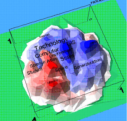
Figure 10- 3D Spatialisation of the difference between the groups of analogue
(red) and digital (blue) map themes, incorporating keywords.
This model has a number of interactive possibilities for interpretation. The present figure is a static one, but comparison to similar visualizations for preceding or future conferences would show the trend or direction in which our discipline is moving. Moreover, selections can be made on the basis of conference themes, of individual papers or of a group of papers, or of individual words or groups of words. Thus one can visualize the relationship of different documents vs. each other, or vs. the overall group of papers.
The amount of time needed to realize this case study is probably not proportional to the actual benefit of this visualization: the number of papers for each theme was already known. But the fact whether all papers actually fitted the theme they were assigned to is another matter; checking this could be realized for instance by evaluating the abstracts in the way sketched above.
Relevance of the Fantasy maps for current information visualisation techniques
The fantasy maps functioned for centuries because they had some characteristics
that were helpful enough to overcome their abstraction:
- a favoured reading direction or at least a very strong directional bias
- the use of cartographic symbols as bearers of meaning
- toponomy was assigned a strong role in map reading
- cardinal directions did hardly play a role
- a priori regionalisation
- topology was not experienced as a help in strengthening the message
- the two dimensions of the plane would not be felt as having the same strict
meaning as taught by Bertin.
-
When we apply these results to current information visualisation techniques,
most of these aspects still seem to be valid, with the exception that because
of quantification, the use of the dimensions has been disciplined, and is no
longer applied haphazardly. Either the third dimension, or the distance from
the centre has been substituted as the favoured reading direction; the documents
that only show links, are meant for browsing and are not related to any properties
of their dimensions, fail to convince as information conveyors.
Literature
Bertin, J. (1977) La graphique et le traitement graphique de l'Information. Flammarion, Paris.
Bertin, J. (1983) Semiology of Graphics. Chicago -University of Chicago Press
Card, S., Mackinlay, J. and Shneiderman, B. (1999) Readings in Information Visualization: using vision to think. San Francisco: Morgan Kaufmann.
-Carte du Tendre. From the book Clélie by Mlle de Scudéry, Paris 1654.
Couclelis, H. (1998) - Worlds of information: the geographic metaphor in the Visualization of complex information. Cartography and GIS, Vol 25-4, 1998, pp 209-220
December, J. (1994) http://www.december.com
Fabrikant, S.I. (2000) Spatialized browsing in large data archives. Transactions in GIS, 4 (1): pp 65-78. http://www.geog.ucsb.edu/~sara/html/research/pubs/fabrikant_tig99.pdf
Fabrikant, S.I. (2001b) Formalizing semantic spaces for Information access. Annals of the Association of American Geographers, Vol 91 no 2, 2001, pp 263-280.
Fabrikant, S.I. and Buttenfield, B.P. (2001) Formalizing semantic spaces for information access. Annals of the Association of American Geographers, 91: pp 263-280. Oxford: Blackwell publishers.
Jiang, B. and F.J.Ormeling (1997) Cybermap: the Map for Cyberspace. The Cartographic Journal, Vol 34, No.2, pp 111-116.
Jongh, Ch.de (2002) - Spatialiseren. Niet-ruimtelijke informatie in kaart gebracht. (Spatialising: mapping non-spatial information). MSc thesis Utrecht University. 81 pp
Kohonen, T. (1995) Self-organizing maps. Springer Verlag, Berlin
Das Reich der Liebe. Zweiter Landchartensatz-Versuch. Johann Gottlob Immanuel
Breitkopf. Leipzig 1777.
Schlaraffenland (Accurata UTOPIAE TABULA, Das ist der Neu=entdeckten SCHALCK-WELT
oder des so offt benannten, und doch nie erkannten SCHLARAFFENLANDES Neu=erfundene
Lächerliche Land=Tabell . DURCH AUTHOREM ANONYMUM). Derived from a book
by Johann Andreas Schnebelin, published 1706 with the "Erklärung der
Wunder=seltzamen Land = Charten Utopiae, so da ist/ das neu = entdeckte Schlaraffenland/
…, from which the map was taken and inserted in many atlasses by Homann
and Seutter; the illustrations here are from J.B. Homann: Atlas novus terrarum
... Nürnberg 1716) . Schnebelin's book was modelled upon Joseph Hall, who
published in 1605 in London a book with the title: Mundus alter et idem ....